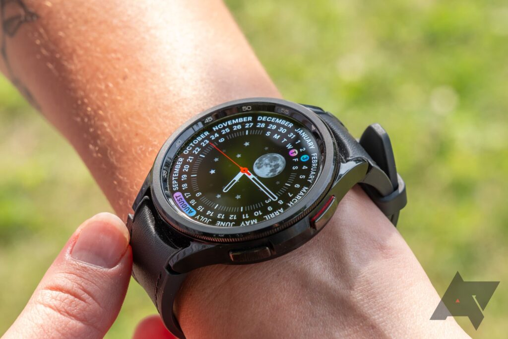
OnePlus’s first smartwatch wasn’t very good. The OnePlus Watch had slick hardware and great battery life, but its proprietary software was a little janky, and its activity tracking was flaky at best. Unlike the first generation, the new OnePlus Watch 2 runs Wear OS, including access to the Google Assistant, Google Wallet, and tons of other apps through the Play Store. It also sets a new record in Wear OS battery life, going up to four days on a single charge even with features like always-on display and sleep tracking enabled.
All of that is really exciting — Wear OS needs variety, and longevity is still a sore spot in smartwatches from all the major players. But the OnePlus Watch 2 has the same kinds of issues as the first generation: the software experience is rough around the edges, and activity tracking still feels inconsistent. So, while I’m excited about what the OnePlus Watch 2 could mean for Wear OS and smartwatches in general, I’m not necessarily all that excited about the watch itself.
OnePlus Watch 2
The OnePlus Watch 2 is OnePlus’s first watch to feature Wear OS. Clever hardware and software allow for astounding battery life, but the day-to-day experience of using the watch is a little underwhelming.
- Four-day battery life
- Convenient, fast charger
- Handsome and high-quality hardware
- Good general performance
- Unrefined software experience
- Questionable health tracking
- Crown rotates for no reason
Price and availability
Decent early discounts
The OnePlus Watch 2 costs $300. It’s available for preorder starting today, with open availability beginning March 4. You can get it on Amazon or directly from OnePlus in Black Steel, which features a black case with a black band, or Radiant Steel, which is silver with a lovely green band. From now through the end of March, you can get $50 off at OnePlus.com if you trade in any watch — smart or otherwise. Or, if you buy it with a OnePlus 12 or OnePlus 12R, you’ll get 30% ($120) off the watch. The two promotions can’t be combined.
From March 11 through the end of the month, Prime members are eligible for $50 off the OnePlus Watch 2 on Amazon.
Specifications
- Case size
- 47mm
- Case Material
- Stainless steel
- Display
- 1.43″ 60Hz AMOLED
- Display resolution
- 466 x 466
- CPU
- Snapdragon W5; BES2700
- RAM
- 2GB
- Storage
- 32GB
- Battery
- 500mAh
- Cellular connectivity
- No
- Wi-Fi connectivity
- Yes
- Software
- Wear OS 4
- Health sensors
- Heart rate, SpO2
- Dimensions
- 47 x 46.6 x 12.1 mm
- Weight
- 80 g (with strap)
- IP Rating
- IP68
- Strap size
- 22 mm
- Colors
- Black Steel; Radiant Steel
- Price
- $300
Design and display
Quality hardware
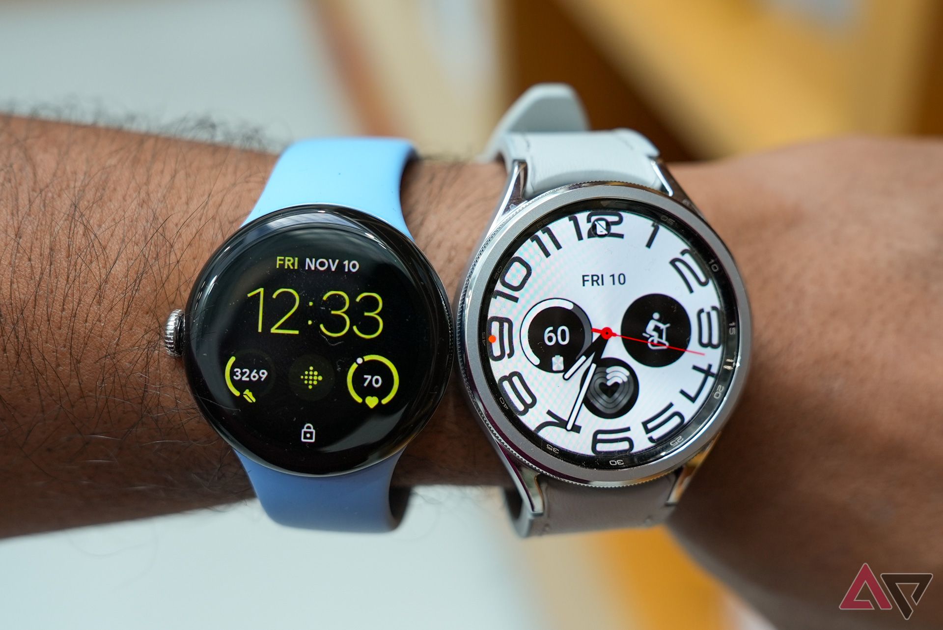
The OnePlus Watch 2 is a big watch; its 47mm case is about the same size as the larger Galaxy Watch 6 Classic, though Samsung’s watch has a larger 1.5-inch OLED where OnePlus’s is 1.43 inches.
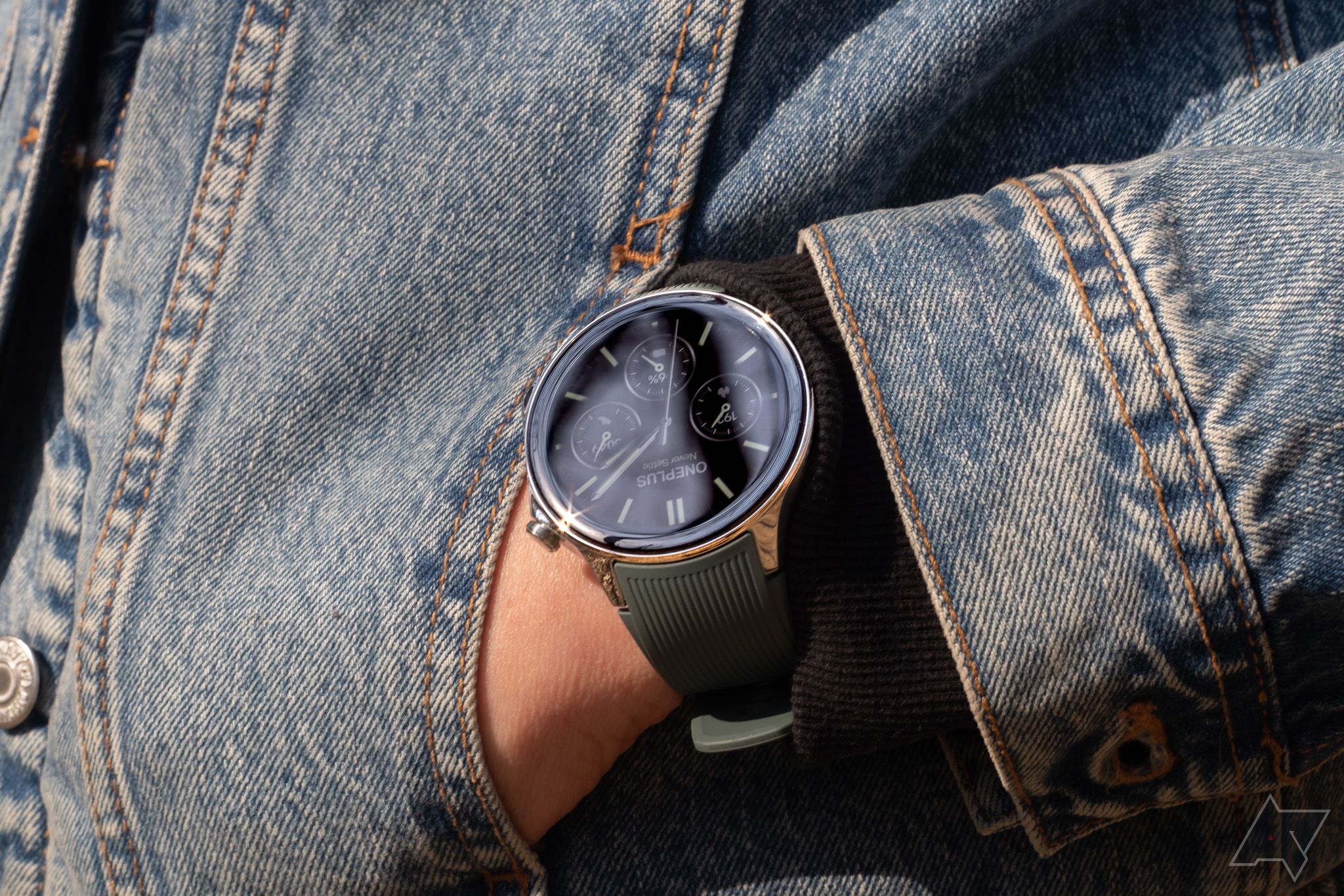
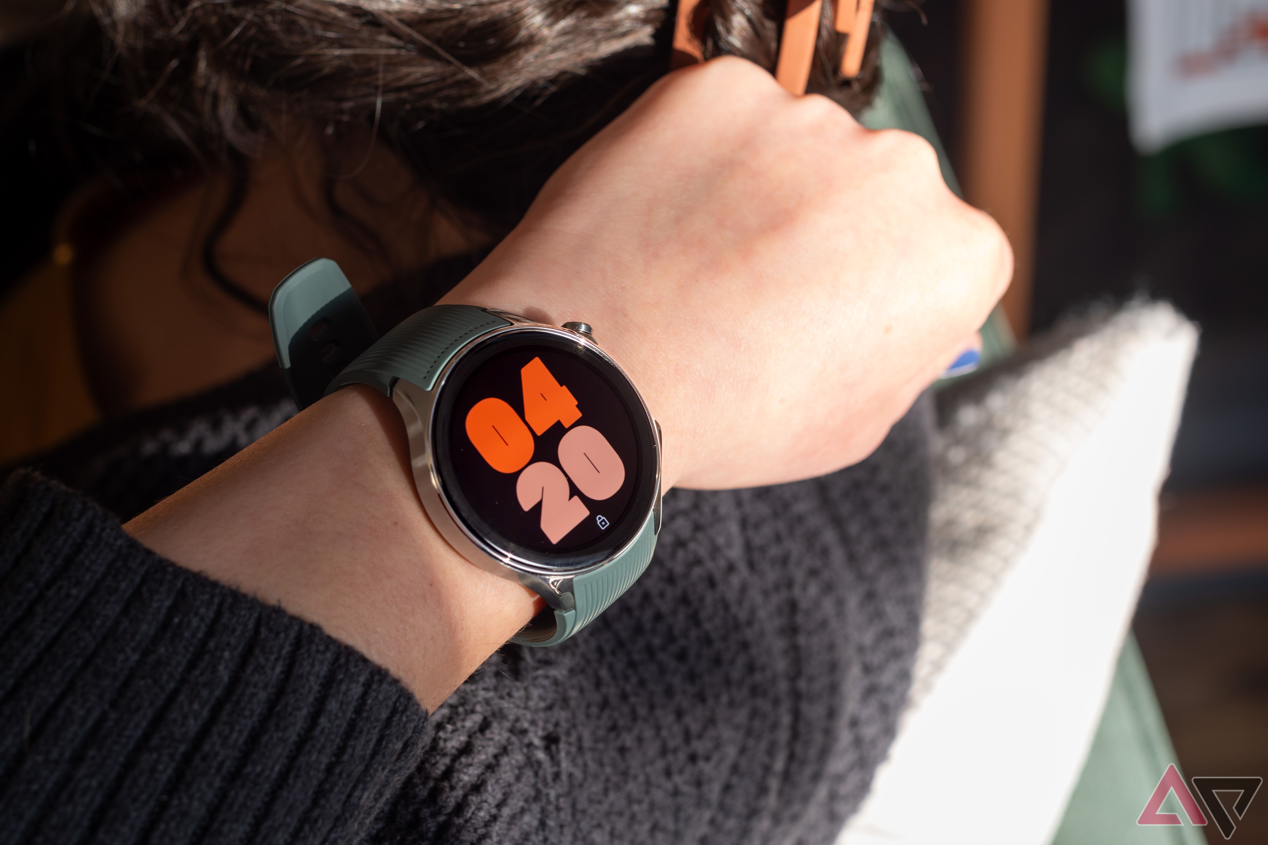
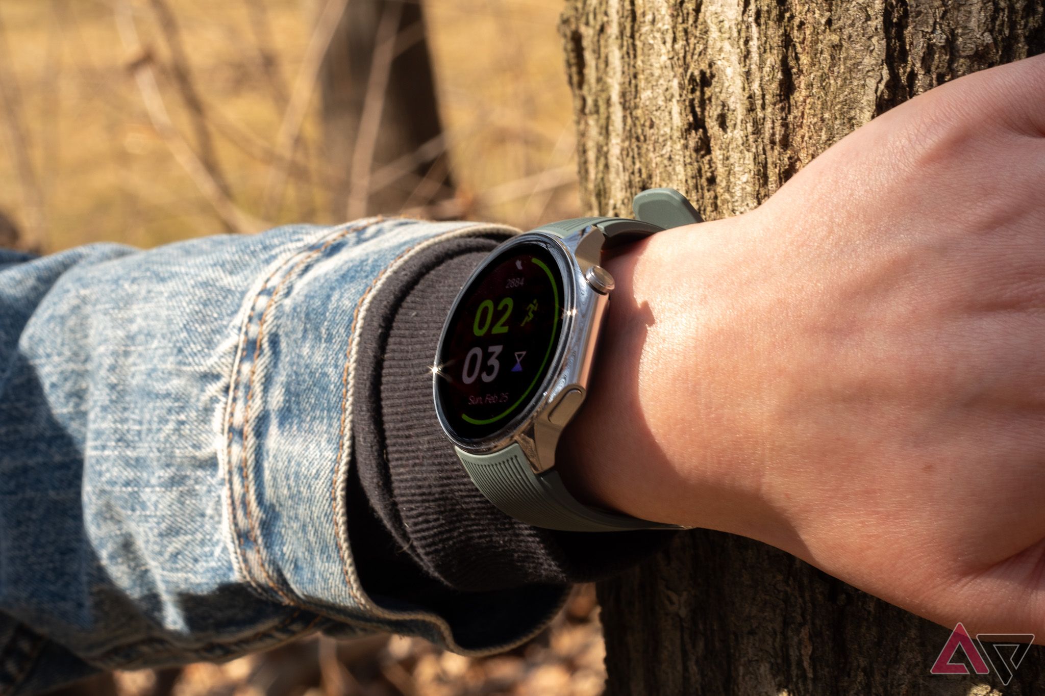
The hardware’s really nice. The case is round with one flat edge featuring two buttons, and the overall shape reminds me of the unique camera bumps on OnePlus’s recent phones. The mix of brushed and polished steel on my Radiant review unit’s case is subtly interesting, and overall, it feels as premium as a smartwatch in this price range should.
I think the pairing of a silver case and green band is a little weird — personally, I like it, but I’d expect more neutral options from a wearable in this price range. The watch takes standard 22mm bands, though, so there are effectively limitless customization options.
One very odd bit about the hardware here: the watch’s home button is styled like a traditional watch crown and rotates like one, too. But unlike in watches from Google and Apple, that rotation doesn’t do anything in the watch’s software. OnePlus says this is by design. Given a lot of people have gotten used to scrolling on smartwatches using rotating crowns, I think OnePlus probably missed the mark in styling the home button this way.
The 60Hz OLED display is vibrant and smooth, and OnePlus says it uses sapphire crystal in the glass that covers it, which should make it more scratch-resistant than watches that use regular old glass. It’s got a peak brightness of 1,000 nits, which matches the Pixel Watch 2, but falls short of the Galaxy Watch 6’s extra-bright 2,000-nit peak. It’s still bright enough to see in most conditions, including outdoors.
I don’t think it’s a major flaw by any means, but the OnePlus Watch 2’s speaker isn’t very good, even by smartwatch standards. It’s also very easy to block if you hold your hand in the wrong position.
Software and performance
Wear OS 4 and then some
OnePlus got clever with the Watch 2: it runs Wear OS 4 on a Snapdragon W5 chipset, but it’s also running a real-time operating system (RTOS) on a secondary, lower-power BES2700 chipset. As OnePlus explains it, the Snapdragon chipset handles more demanding tasks like running Wear OS apps, while the less demanding RTOS handles background tasks like monitoring health sensors and communicating with your phone.
That hardware-software combination delivers remarkable battery life (more on that later), and critically, doesn’t seem to impact the user experience. If I didn’t know about the dual-OS business, I wouldn’t guess anything unusual was going on; in my time with it so far, the OnePlus Watch 2 has been as responsive as other smartwatches powered by Qualcomm’s W5 series, like the Pixel Watch 2 and TicWatch Pro 5.
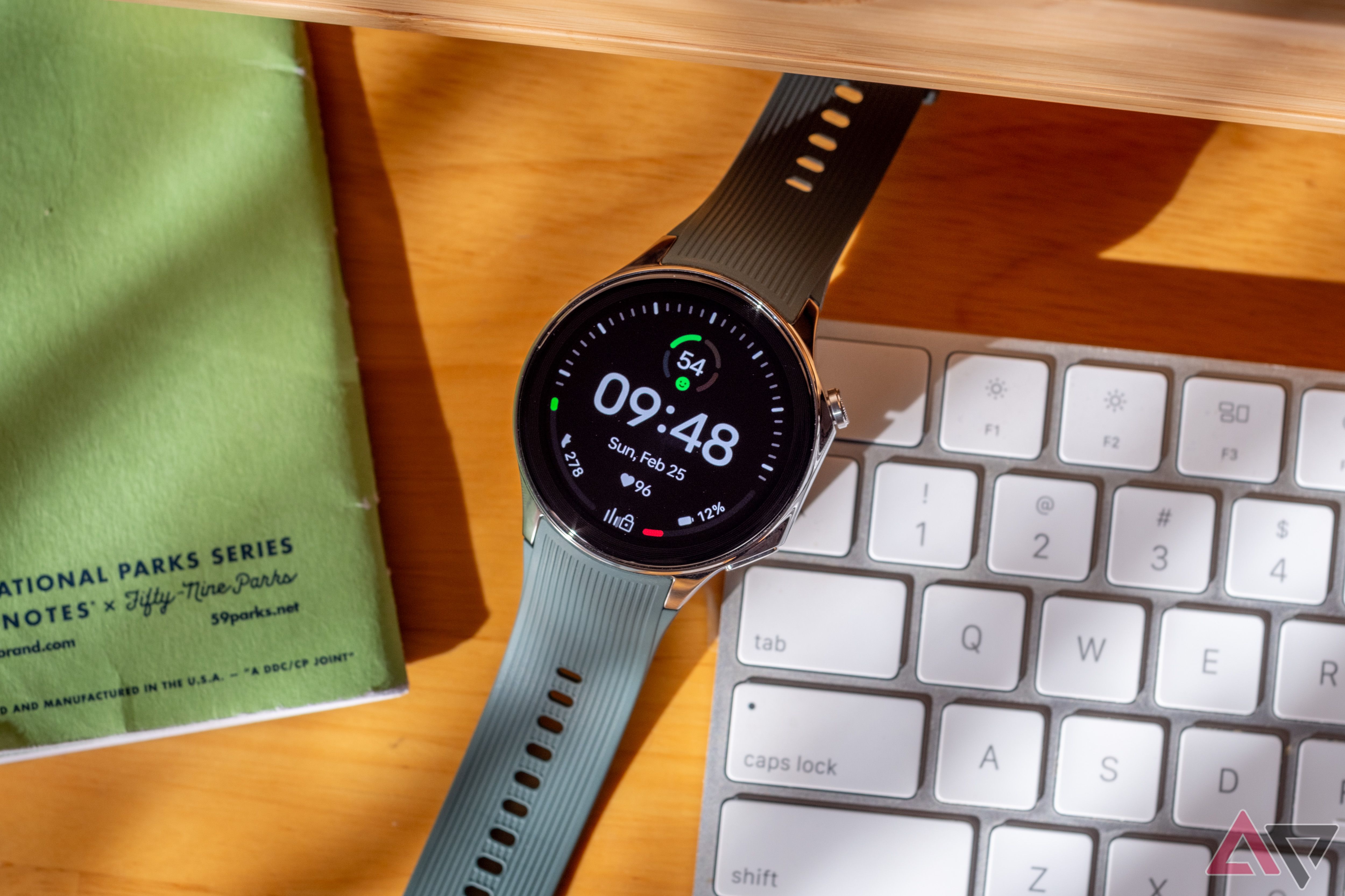
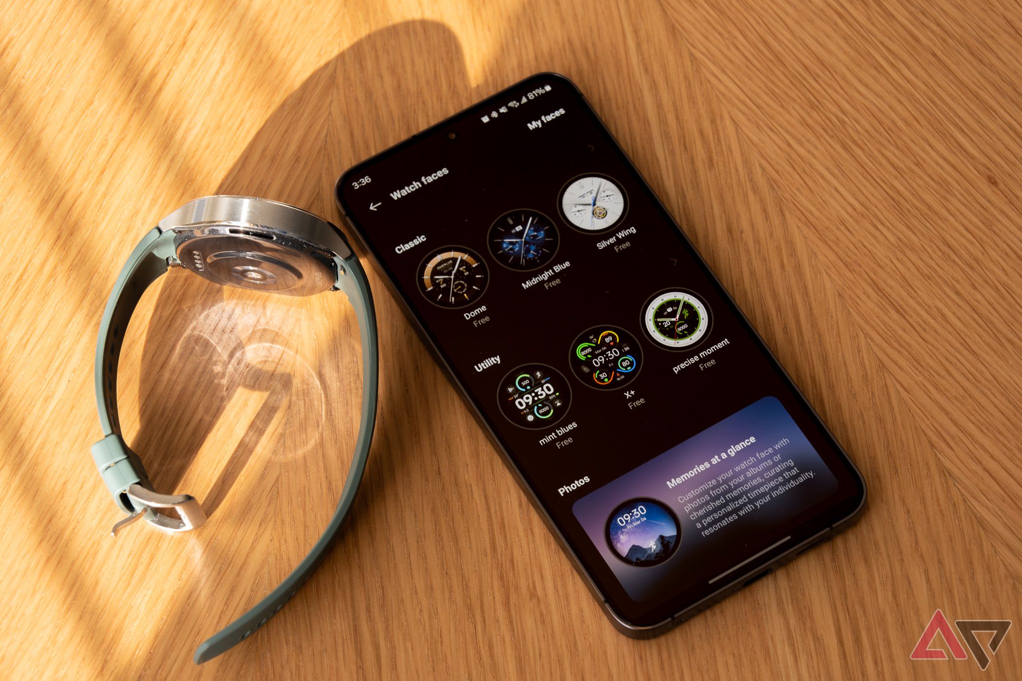
Wear OS 4 is fundamentally the same here as on other watches, but OnePlus’s customized elements lack the finesse you’ll get in a Wear OS watch from Samsung or Google. Many of the OnePlus Watch 2’s watch faces, for example, look like they came straight out of the Android Wear era.
There are a couple I like, but way too many on offer either try to mimic analog watch faces with gaudy skeuomorphic gradients or offer basic, dated digital-style layouts. An odd bug also intermittently changes the color of my watch face, seemingly at random. It always corrects itself eventually, but that it happens at all is bizarre.
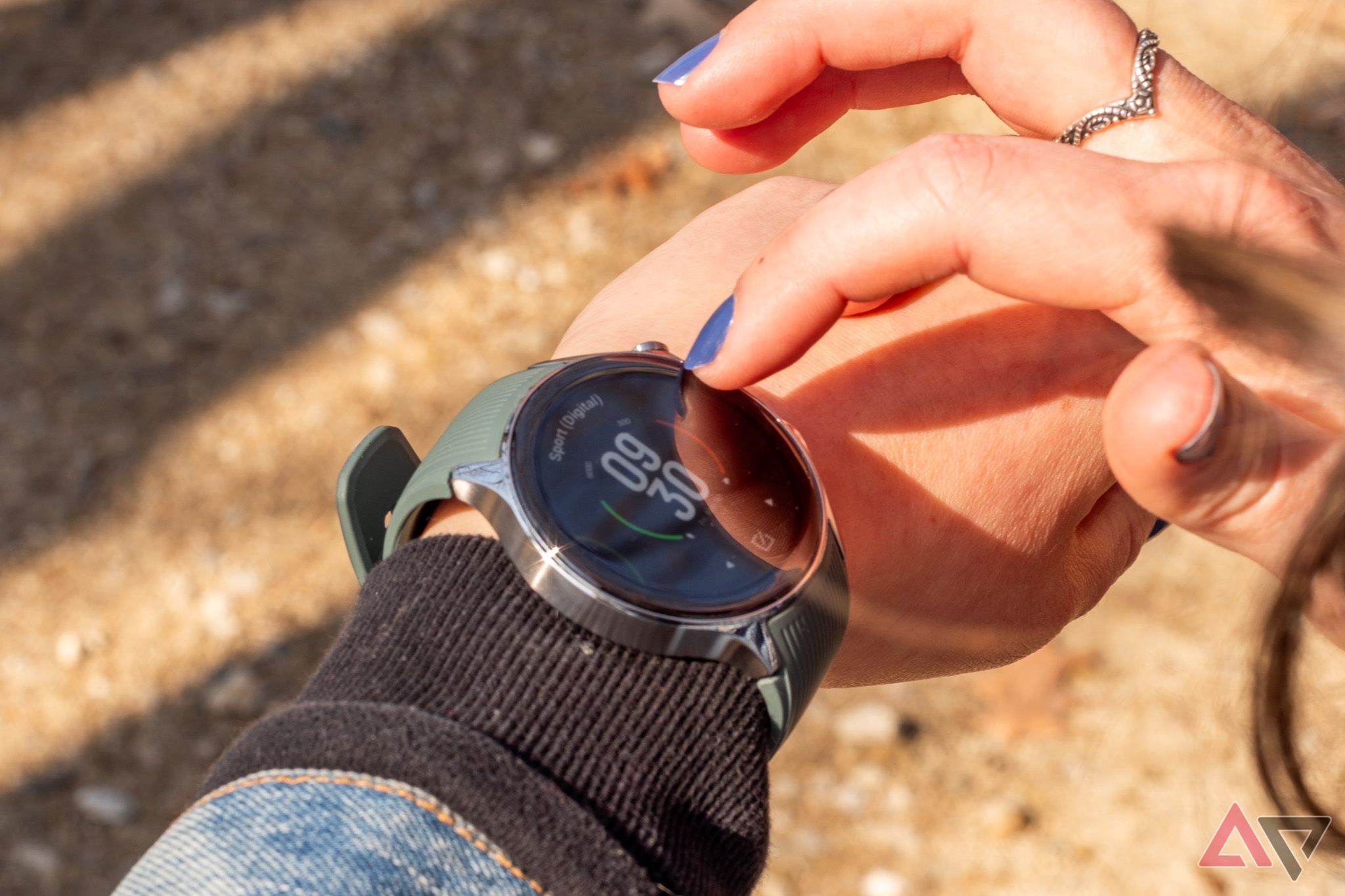
Of all things, the app drawer on the OnePlus Watch 2 is weirdly bad. The default “Planet” view is sort of like what Apple does on its watches: an array of bubbles you navigate in two dimensions. It looks neat, but it’s not very functional. You can also opt for a grid-style view like you’ll get on Samsung watches or a standard list view. Those are both better, but they still have weird, slippery scrolling physics, unlike what you’ll experience around the rest of the OS — I find myself flinging the apps list up and down when I’m not trying to. It’s just not very intuitive.
One anecdote that I think sums up the OnePlus Watch 2’s software experience pretty well: the watch’s preinstalled Alarm app doesn’t have an option to set silent alarms. You can make alarms silent by turning the alarm volume down all the way in the watch’s settings; alarms will still vibrate, which is what I’m after. But it took me a few days to figure that out, so my partner and I both woke up to a hilariously bad synthesized jazz ditty all week.
The app drawer on the OnePlus Watch 2 is weirdly bad.
You could call that user error (and I’d have a hard time arguing with you), but I think it speaks to an overall lack of sophistication in the parts of this software experience OnePlus had a hand in. The Alarm app gives options for time, frequency, and ringtone and even lets you assign names to your alarms, but to change an alarm’s volume, you have to make your way to the watch’s sound settings, four navigation steps away. All the Wear OS stuff is fine — but OnePlus’s tweaks and preinstalled apps all just feel a little off to me.
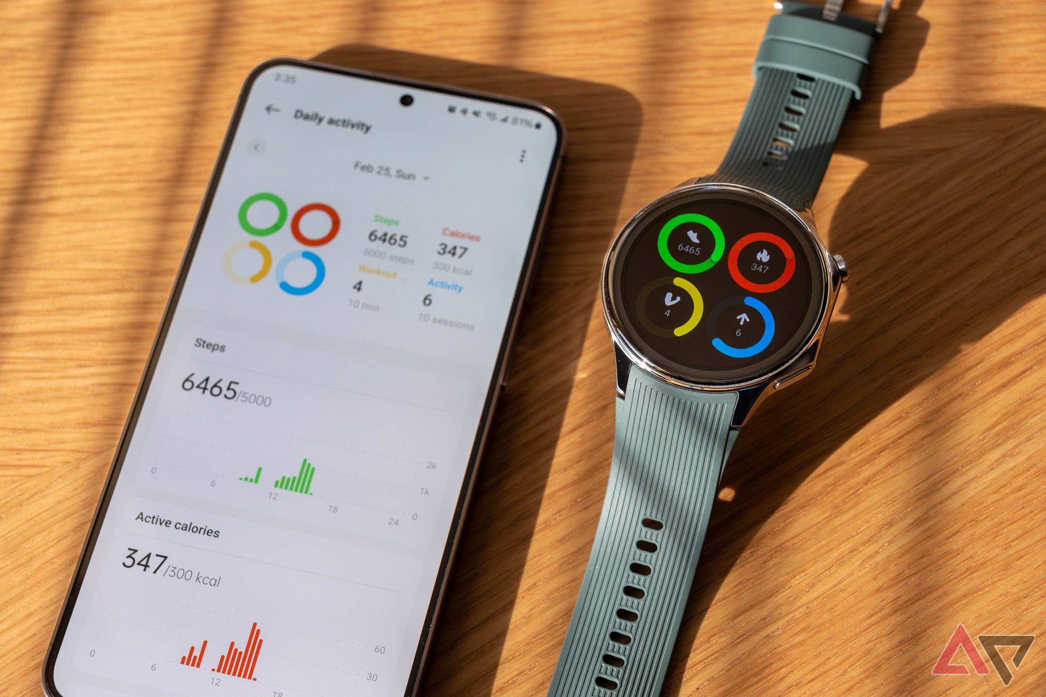
The OnePlus Watch 2 is managed on your phone with OnePlus’s OHealth app. It does the regular watch companion app stuff: you can change watch faces and Wear OS tiles, manage notification settings, and review the health and fitness data the watch collects.
Health tracking
Still questionable
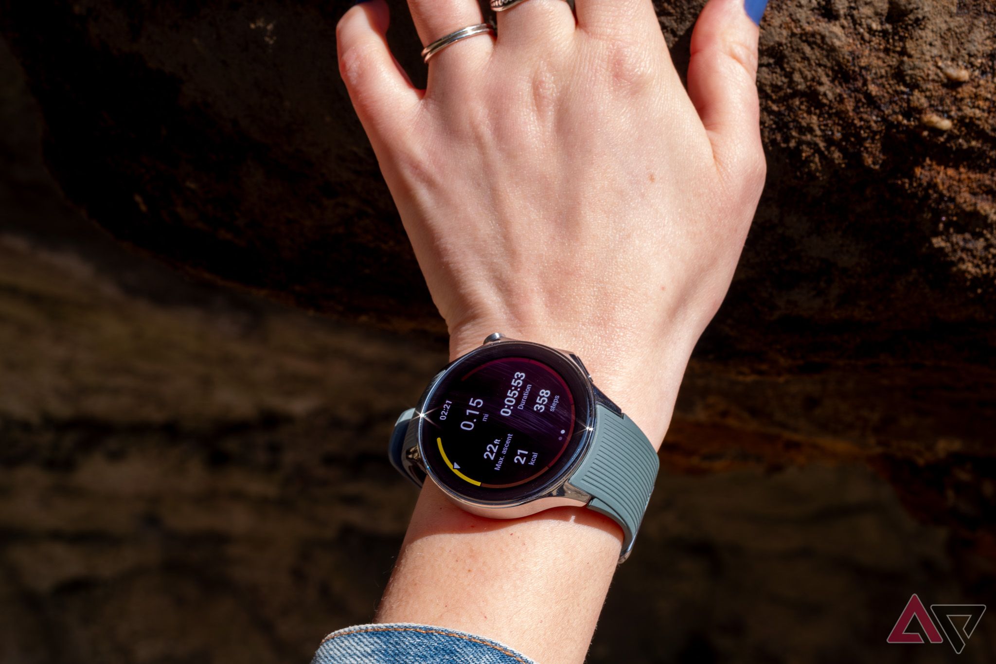
The OnePlus Watch 2 tracks your activity and sleep and offers specialized feedback for a few activities. It can analyze your running to let you know how you could improve your form in several ways, like left-right balance (mine is apparently Excellent) and “vertical oscillation” (rated a more believable Poor).
The OHealth app also tries to estimate how long it’ll take your “energy to recover to optimal status” after a workout. That seems like a calculation OnePlus couldn’t possibly have enough data to make, and I’m generally skeptical of features like this in wearables — especially ones from less established players.
Similarly to some other smartwatches I’ve used recently, the OnePlus Watch 2 displays a sort of graph depicting a range for your heart rate while you’re working out, with an arrow indicating which of a handful of zones you’re in. The Pixel Watch 2 does this, too, and I find it really helpful while running.
But the indicator on Google’s heart rate graph moves freely to show where in each zone you currently are — on the OnePlus Watch 2, the arrow just snaps to the middle of whichever zone your heart rate is currently in, with no easily parsed indication of how close you are to the upper or lower bounds of that range. That lack of readable detail somewhat defeats the purpose of having an interface like this.
The OnePlus Watch 2 has a handful of bespoke interfaces for other exercise types, too, but the selection is weird: there’s one for tennis, one for skiing, and one for badminton. Badminton mode keeps track of things like the longest you went in a game without the shuttlecock hitting the ground, which is fine enough — but I can’t imagine there are enough people serious enough about badminton that they’ll buy a smartwatch for its badminton-tracking capabilities. It strikes me as a weird way to spend limited development resources, especially when other aspects of the software are still lacking polish.
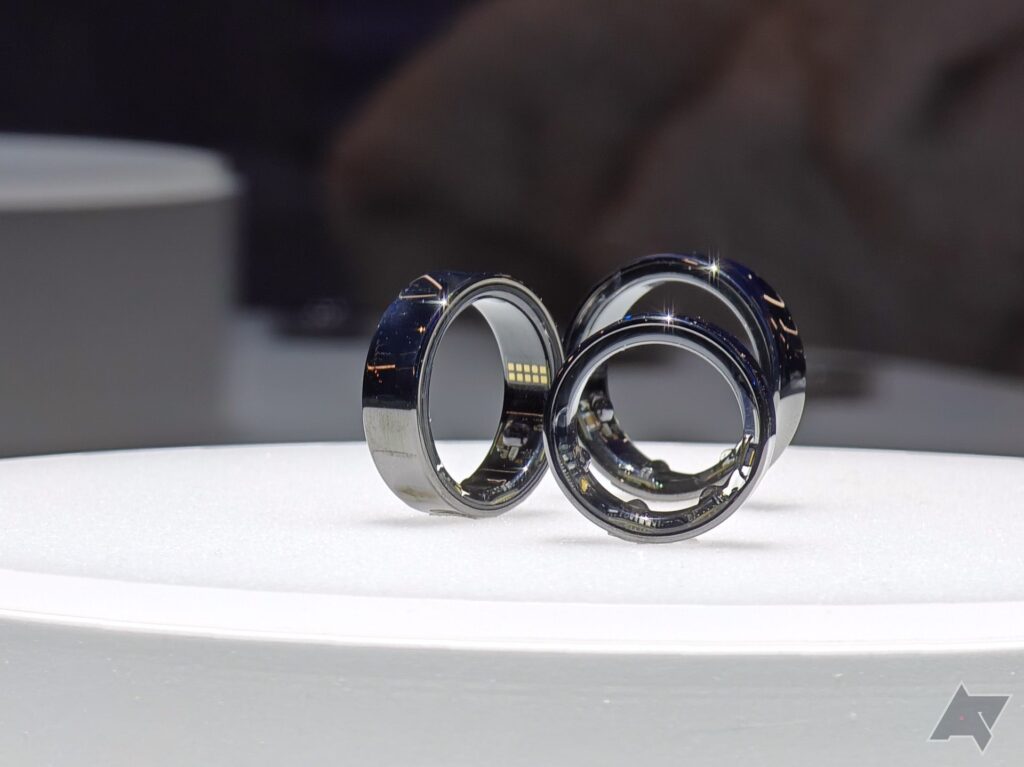
On the whole, I feel like OnePlus’s activity tracking isn’t very accurate, and compared to the Oura Ring I’ve been wearing at the same time, I’m seeing a lot of inconsistencies. One day, Oura logged 10,015 steps, and OHealth reported 7,981; a few days later, Oura had me at 5,839 and OHealth at 6,966. This is anecdotal, but other smartwatches and wearables I’ve used tend to get step counts more similar to Oura than the OnePlus Watch 2 has. Unless all of those wearables are miscounting, it seems like the OnePlus Watch 2 probably is.
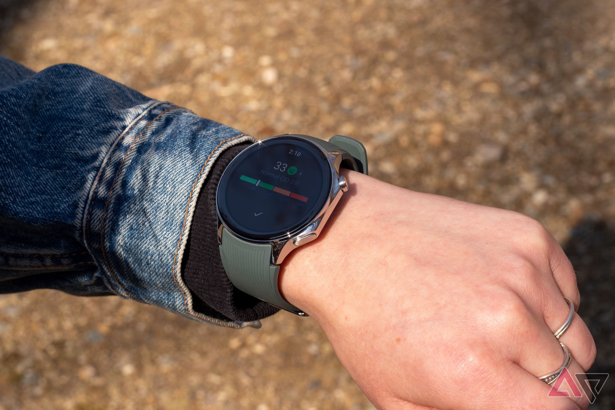
Sleep tracking seems more consistent; compared to data in the Oura app, OHealth shows similar times for falling asleep and waking up and similar sleep stage patterns. OnePlus also gives you a stress score out of 100 based on heart rate variability and “other physiological parameters.” I haven’t gleaned any useful insights from OnePlus’s stress tracking. So far, it seems like it’s just approximating physiological arousal — which can be caused by stress, but also by plenty of non-stressful situations.
Battery life and charging
OnePlus kills it here
OnePlus promises a too-good-to-be-true 100 hours of mixed-use on a single charge on the Watch 2. But thanks to the watch’s burly 500mAh battery cell combination and unique dual-OS approach, the thing actually delivers. Battery life on the OnePlus Watch 2 is phenomenal.
I got my review unit on Friday afternoon, and by the time I got it set up, I had about 50 percent battery remaining. I used it like normal for the rest of the day and over the weekend (with the always-on display on), and I didn’t get a low battery warning until Sunday night, more than 48 hours later.
This kind of battery life on a Wear OS watch is groundbreaking. Simpler wearables and purpose-built watches from Garmin can last weeks on a charge, but the longest-lasting Wear OS watch I’ve tried, the similarly sized Mobvoi TicWatch Pro 5, could eke out about 72 hours between charges, and it accomplished that partially by using a secondary low-power display layer to pull AOD duty. Even with heavier use — lots of GPS use, that kind of thing — OnePlus says the Watch 2 can make it a full 48 hours. I believe it.
I hope Google and Samsung are paying attention.
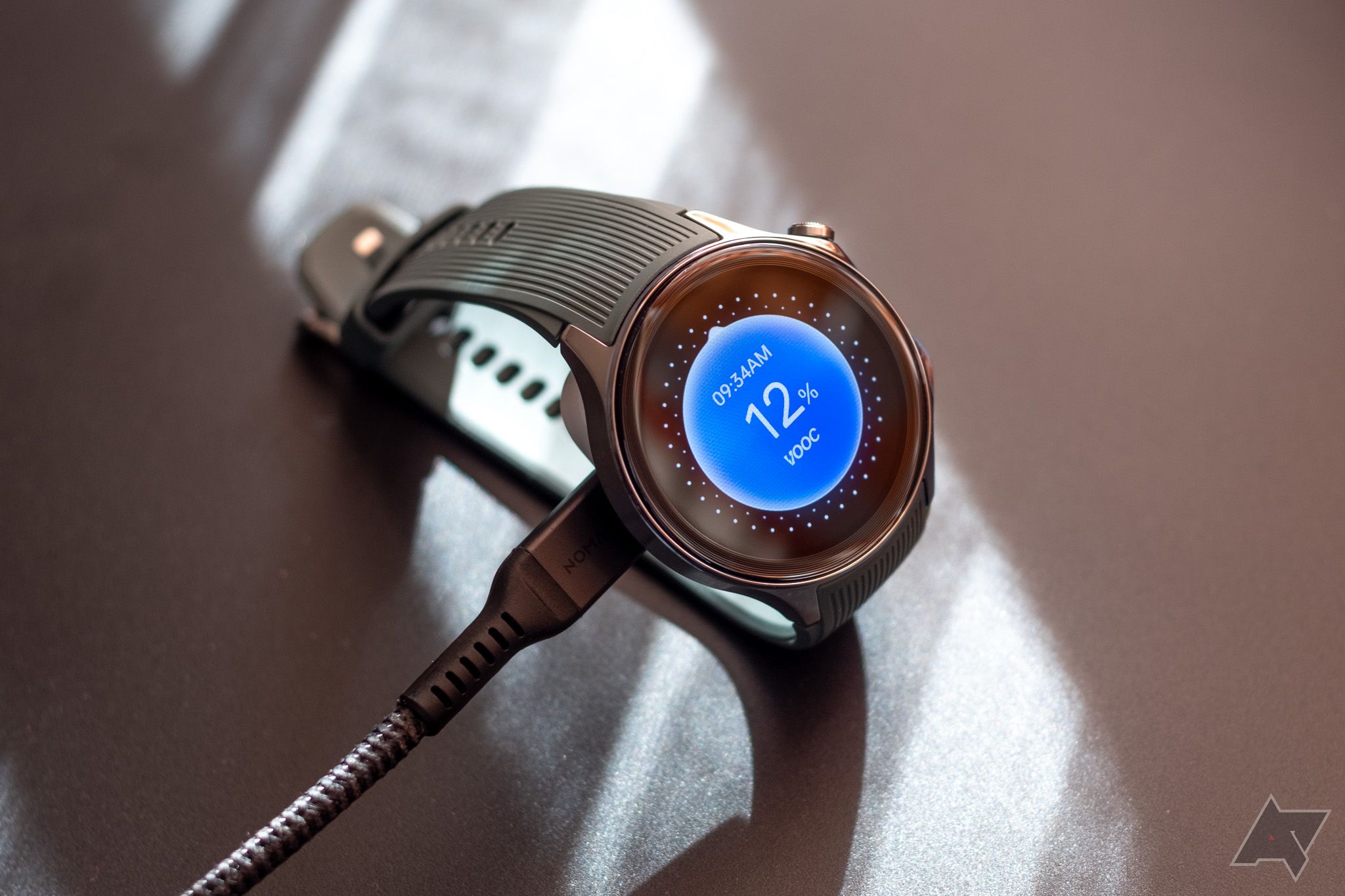
Not having to take a watch charger on overnight trips is great, but OnePlus’s charger happens to be great for travel. While most watch chargers are permanently attached to USB cables, the OnePlus Watch 2’s charger is a small puck with USB-C input, which means packing one less cable for long trips.
I’ve written about wanting this exact smartwatch charger, and it’s as convenient as I hoped it’d be. Rather than having to find somewhere to plug in a USB cable (port space is at a premium in my house), I can just pop the adapter onto any USB-C charger.
It’s fast, too: the adapter charges at up to 7.5 watts, which fills the watch in just under an hour. It can also get the watch to 25 percent in about 10 minutes, so charging it while you shower, even just a couple times a week, is enough to keep it topped up all the time. I’m really going to miss this charger on the next smartwatch I use.
Overall, this is an A+ battery and charging situation — no notes. I hope Google and Samsung are paying attention.
Competition
Surprise, it’s mostly Samsung and Google
At $300, the OnePlus Watch 2 is priced competitively. Its two biggest rivals are, of course, the Samsung Galaxy Watch 6 and the Google Pixel Watch 2.
The larger 44mm Galaxy Watch 6 retails for $280 and is often available for less. Its display is a little smaller than the OnePlus Watch 2’s, but it gets a lot brighter outdoors. Samsung’s fitness tracking also feels more accurate, making the general software experience more cohesive and refined. The Watch 6 likely won’t last two days on a charge, though, and the OnePlus Watch 2 comfortably makes it three to four days.
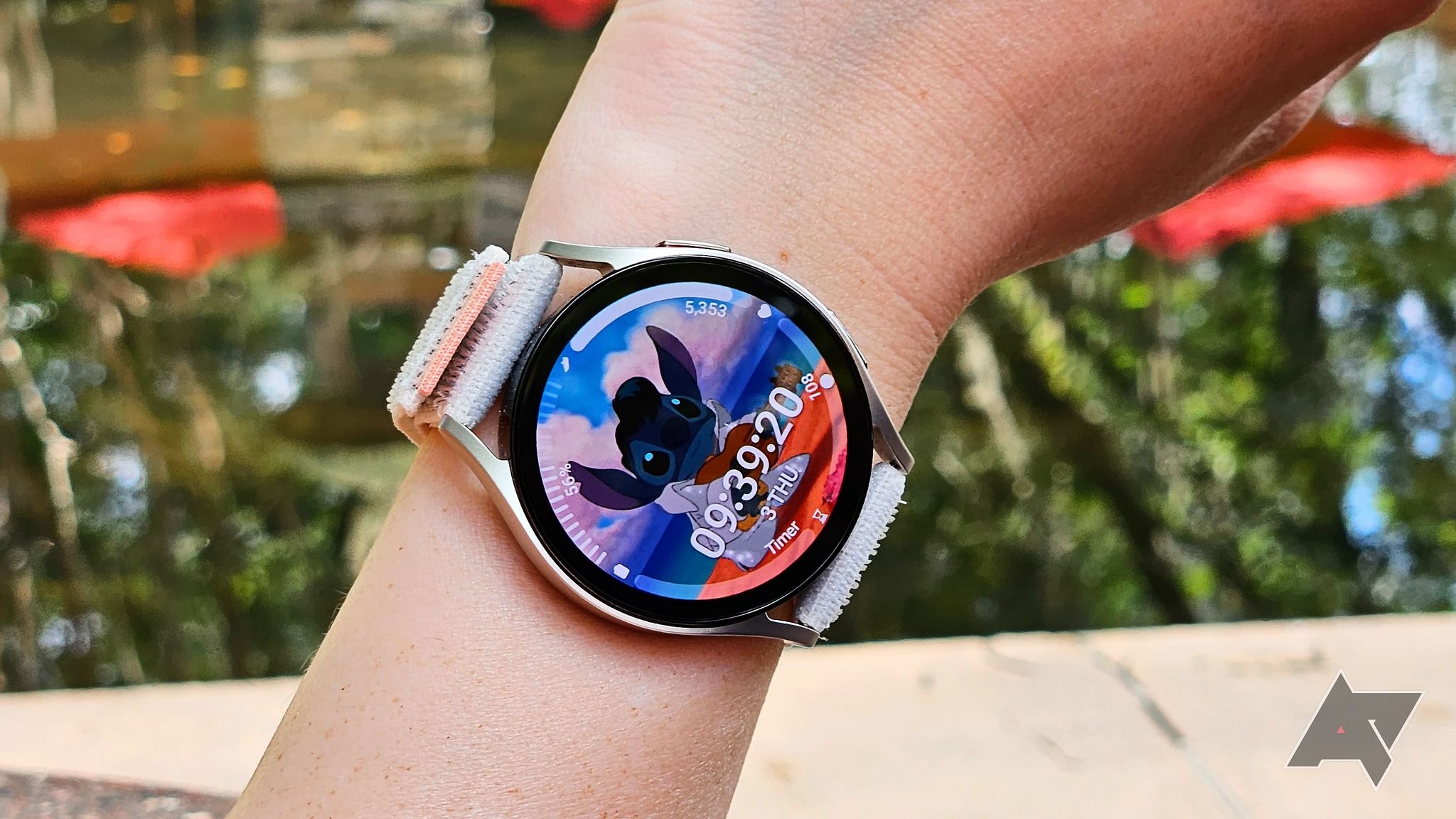
Samsung Galaxy Watch 6 review: Bright but never bold
Call it boring, but it’s still the best Android smartwatch, hands down
The $350 Pixel Watch 2 is significantly smaller than the OnePlus Watch 2: 41mm versus 47. The Pixel Watch’s stock Wear OS experience and great watch faces make for a polished user experience, and Google’s Fitbit-backed health tracking is more reliable than OnePlus’s, though. But again, while the Pixel Watch 2 lasts 30 or so hours on a charge, the OnePlus Watch 2 comfortably lasts three times as long.
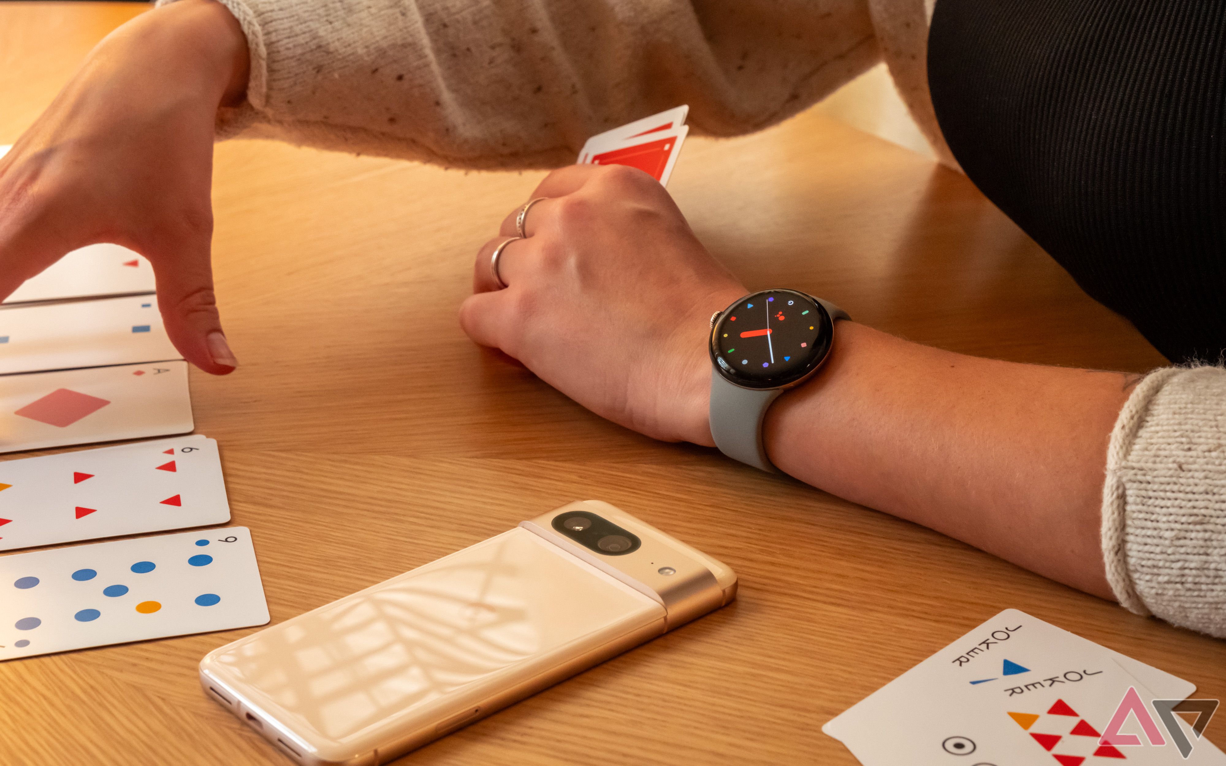
Google Pixel Watch 2 review: The watch we wanted last year
Reliable battery life and improved fitness tracking, wrapped up in a near-identical package
Should you buy it?
What are your priorities?
The OnePlus Watch 2 is exciting. It’s a challenger to the emerging Wear OS duopoly jointly held by Samsung and Google, a mostly viable alternative that’ll hopefully force established players in the space to step their game up. Its battery life is head-and-shoulders above what’s offered by any other Wear OS smartwatch on the market and even competing premium options like the $799 Apple Watch Ultra 2. Its charger is also fantastic. The entire industry needs to pay attention to what OnePlus has done here.
But at the same time, besides its clear advantages in battery and charging, the OnePlus Watch 2 doesn’t have much going for it. Sure, it runs Wear OS and has access to all the apps that come with it, but the overall experience just isn’t as robust or cohesive as what you’ll get from a watch made by Google or Samsung. Activity tracking is iffy, UI elements as basic as the app drawer are kind of a pain to interact with, and many of OnePlus’s preinstalled watch faces are eyesores.
If your A1 priority in a wearable is long battery life and you don’t care much about accuracy in physical activity tracking, the OnePlus Watch 2 is definitely worth your consideration. But if you just want a smooth smartwatch experience and days-long battery is more of a nice-to-have, you might want to wait for an eventual OnePlus Watch 3. Personally, I’m looking forward to it.
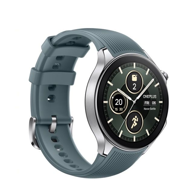
OnePlus Watch 2
The OnePlus Watch 2 is OnePlus’s first watch to feature Wear OS. Clever hardware and software allow for astounding battery life, but the day-to-day experience of using the watch is a little underwhelming.
